


Death by COVID-19 hides in plain sight
We’re vastly undercounting fatalities induced by SARS-CoV-2, never mind infections


Photo by Andrew Mercer / CC BY-SA (https://creativecommons.org/licenses/by-sa/4.0).
[Updated December 4, 2020]
“Reopening” in the United States has been a mixed bag. While it has been posited that state-issued lockdowns throughout the country helped spare millions of confirmed infections, they were as patchwork as could be, and were instituted in the wake of an otherwise confused and slow response. Now, we have been trying to reestablish some kind of normalcy based on insufficient and dangerously misleading data. An expanded dataset on excess deaths, courtesy of the CDC, indicates that we are undercounting fatalities induced by SARS-CoV-2, never mind infections. That has a serious bearing on how we navigate the pandemic. Not only is data used to justify action; it is also influencing, and being harnessed to influence, our behavior and decision-making.
There are a multitude of reasons for why the official COVID-19 numbers are problematic.¹ Of primary concern, however, is the practice, intentional or not, of categorizing a death in a way that doesn’t account for infection by SARS-CoV-2, even if it was possible or likely that COVID-19 was a factor. Put differently, there is no system in place to prevent a death from being categorized solely as “pneumonia,” or “ischemic heart disease,” or “diabetes,” instead of “COVID-19” (or some combination thereof).
Very early on, China was already being accused of this. It is this behavior, in large part, that has helped mask the human cost of the pandemic, as well as the full risk that we as a nation assume in the form of mortality (or infection). Becoming better informed will most likely, and perhaps ironically, require us to look past official COVID-19 tallies.
Enter in the metric of excess deaths.
For participating countries in Europe, the excess deaths metric has long been tracked by the likes of the EuroMOMO project. Put simply, excess mortality is the cumulative number of deaths above and beyond what we would normally expect to see based on historical figures.
In the United States, the CDC has taken a page out of EuroMOMO’s book by making similar data available to the general public. A cursory glance at that data suggests that the fatality rate associated with COVID-19 is higher than reported. (Ergo, the infection rate must be higher, as well.)
The CDC takes things a step further than EuroMOMO, though. They attempt to associate those excess deaths with COVID-19. In their own words,
Counts of deaths from all causes of death, including COVID-19, are presented. As some deaths due to COVID-19 may be assigned to other causes of deaths (for example, if COVID-19 was not diagnosed or not mentioned on the death certificate), tracking all-cause mortality can provide information about whether an excess number of deaths is observed, even when COVID-19 mortality may be undercounted. Additionally, deaths from all causes excluding COVID-19 were also estimated. Comparing these two sets of estimates — excess deaths with and without COVID-19 — can provide insight about how many excess deaths are identified as due to COVID-19, and how many excess deaths are reported as due to other causes of death. These deaths could represent misclassified COVID-19 deaths, or potentially could be indirectly related to the COVID-19 pandemic (e.g., deaths from other causes occurring in the context of health care shortages or overburdened health care systems).²
Their approach does two things for us:
It demonstrates that the pandemic is killing a large number of Americans in one way or another.
It casts doubt on the veracity of cause of death information, lending credence to the suspicion that actual fatality (and infection) figures are higher than reported.
In order to see for oneself that there has been a sudden and grave spike in the mortality rate that could only be due, however broadly, to the pandemic, one need look no further than weekly total deaths from all causes, with and without COVID-19:

As can be seen from the infographic, not only have weekly deaths from all causes excluding COVID-19 repeatedly exceeded the threshold, but they did so even during the original lockdowns where we were all supposedly safe(r) at home. Some of us even received insurance premium refunds because we weren’t driving as much. That doesn’t make sense, unless some of the deaths were at the hands of SARS-CoV-2 but weren’t recorded as such.
While there may be delays and other gaps in the completeness of the data (especially for the most recent weeks, creating the faulty impression that rates are dropping),³ this expanded dataset may still be more reliable than official statistics. Unless state and federal authorities are manipulating the raw numbers of their dead, we may be getting a more accurate and blessedly non-politicized view of the real cost of this affliction in terms of lives lost. Moreover, the data may help instill a more genuine sense of the risk of further mortality, never mind infection.
Meanwhile, official COVID-19 numbers can be massaged six ways to Sunday, and there is immense financial incentive to do so. But that need not be the case; even with no intent to falsify data or otherwise mislead, we may arrive at the same outcome: death certificates lacking COVID-19 entries where they might have been warranted. Digging deeper paints a picture of the potential scope of this.⁴
Initially, the more obvious and widely held belief was that one of the primary complications of COVID-19, if not the primary complication, was pneumonia. In fact, one head of emergency care in Italy, Dr. Roberto Cosentini, stated in April of this year that COVID-19 is nothing like the flu, but rather like a “very severe pneumonia.”
A Sky News special report about COVID-19 on location in Italy, April 2020.
Since then, we have been learning that it’s even much more than that. By now, SARS-CoV-2 has demonstrated that it triggers or exacerbates many other medical complications besides pneumonia that can prove fatal. Some others are heart disease and hypertension. But, let’s stick with pneumonia for now, since certain tabular presentations of the CDC’s dataset hone in on that.
Logic would dictate that if all screening, testing, classification, healthcare, and recording activities are performed without error and in good faith, all cases of pneumonia where the novel coronavirus is not present are identified and treated as such. Cause of death, if there is one, is strictly coded as one of the traditional pneumonia categories, not as COVID-19. Additionally, pneumonia numbers for this year should be more or less in keeping with numbers to-date from years past. We understand which cases of pneumonia are to receive typical pneumonia diagnoses, and which are suffered as a consequence of infection by SARS-CoV-2, if only to provide appropriate medical treatment in the first place. In the process, we keep separate what should be separated.
In the same vein, we would expect states reporting low rates of COVID-19 fatalities to also report few pneumonia fatalities. Why? Well, that which crushes the COVID curve should crush the pneumonia curve. After all, pneumonia can spread in much the same way that we’ve been led to believe COVID-19 may spread.
Yet, the current pneumonia figures for various states, indeed the entire nation, tell a startling story.
Take Oregon, a state which has a relatively small number of deaths attributed to COVID-19 and was, by some accounts, an early leader in reversing the rising national trend of SARS-CoV-2 transmission. Across previous years for which full data is available (1999–2018) from the CDC’s WONDER system, the state has seen an annual average of roughly 483 deaths from all causes of strictly classified pneumonia. Thus far in 2020, it has seen 1,207 such fatalities with no reference to COVID-19, per the excess deaths data, and the year isn’t over. On the other hand, it has officially witnessed a lower 974 deaths from COVID-19; the counts are upside down.⁴
If Oregon were to continue at that pace of death by pneumonia for the rest of this year, it would see a growth in strictly classified pneumonia deaths of nearly 300% over 2018, for instance, where it only saw 331 such deaths. In other words, it could finish the year out by losing a total of some 1,303 people to a strictly classified form of pneumonia with no mention of COVID-19. Simultaneously, it would somehow manage to keep COVID-19 fatalities within some range of yearly, pre-pandemic averages for pneumonia. That’s troubling. What good is it to feel safe from SARS-CoV-2 when your chances of succumbing to “pneumonia” are apparently now 3x in Oregon?
They are not unique in this. Oregon’s neighbor to the east, Idaho, is demonstrating something similar. Their count of 474 pneumonia fatalities has already exceeded the state’s full-year historical average for every year since 1999, even though there’s a month left in 2020. This count is only now noticeably surpassed by their separate COVID-19 tally of 1,023.
Oregon’s governor is a democrat, Idaho’s a republican, so it’s difficult to attribute this to partisanship. What they both might be accomplishing, though, is that their populations feel at ease that their COVID-19 numbers are “low.” Unfortunately, this is a false sense of security paving the way for economic “reopenings” and, more significantly, a lowering of one’s guard.
If these numbers fail to impress, we can upgrade to Texas and Florida. The former state’s worst year for pneumonia was 2002, when it lost 3,637 people to some form of the illness. So far in 2020, Texas has already lost 10,746 individuals to strictly classified forms of pneumonia. That puts the state on pace to amass more than 11,601 strict pneumonia deaths this year, with no acknowledgement of COVID-19 on the death certificates.
Florida, already suspected of data suppression (especially after it fired its COVID-19 data portal architect in early May), is right behind Texas. To date, they have recorded 10,588 strict pneumonia deaths with no attribution to SARS-CoV-2 whatsoever. Compare that with 3,311 pneumonia deaths in the year 2000, their worst year.
The numbers for the whole country follow this pattern of record pneumonia deaths. Thus far, we are at a staggering 136,049 deaths strictly classified as pneumonia nationwide. In 2018, the last full year for which this data is available in WONDER, we saw a drastically lower 47,956 deaths from some form of pneumonia for the entire year. That is a difference of 88,093 more people dead in 2020 than in 2018 from causes strictly classified as some type of pneumonia, and we’re only in the first half of October. At that rate, roughly 146,885 of us and our loved ones will succumb to some strictly classified form of pneumonia without any attribution to COVID-19. That is an increase of more than 200% over 2018’s numbers, or about an average of 401 people per day.
Mind you, that’s in addition to the 298,387+ people we are on track to officially lose to COVID-19 by the time this year is over.
In spite of our massive population of “vulnerable adults” getting ever older, and our population numbers only growing year on year, pneumonia deaths in the United States from 1999–2018 peaked all the way back in 2002, with 64,954. The overall trend has since been on the decline. As highlighted above, we have clearly surpassed 2002’s number as well, even though there’s about a month left in 2020, and in spite of a lag in receiving, processing, and publishing death data.


[1] The number of deaths from strictly classified forms of pneumonia, and [2] the number as a % of the population of the United States, have been on the decline overall since they peaked in 2002 (for the 1999-2018 period).
Lest you think that what we are witnessing is a manifestation of the beleaguered CDC’s mishandling of data, causes of death (when known) are entered on death certificates submitted by local jurisdictions where the deaths occurred, to ultimately percolate their way up to the level of national statistics. The records eventually find their way to the National Center for Health Statistics (NCHS), where they are processed, coded, and tabulated. The CDC has merely made that data accessible via web pages and data systems like WONDER.
It appears that pneumonia is not the only severe medical complication demonstrating this pattern. In fact, evidence that COVID-19 may be a blood vessel disease is emerging. Many have suffered sudden and fatal heart attacks induced by the virus. Are general rates of ischemic heart disease following similar patterns to that of strictly classified types of pneumonia, then? What about other leading causes of death, such as hypertension and diabetes?
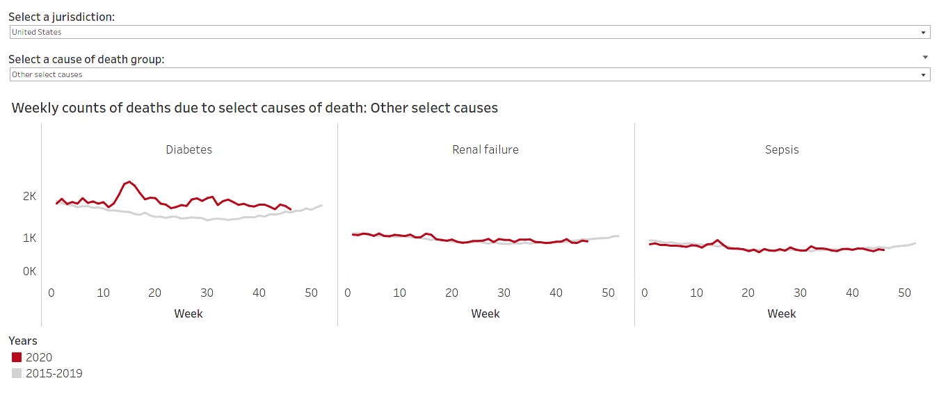
On June 3, 2020, the CDC began further expanding the dataset in this regard. Other specific causes of death besides pneumonia and influenza have been incorporated. Their selection was based on death certificate analysis. The most prevalent comorbid conditions mentioned on death certificates, where COVID-19 was also listed, are now tracked along with pneumonia and influenza. These include other respiratory illnesses, circulatory diseases, malignant neoplasms, and Alzheimer’s and other dementias.
While it is outside the scope of this report to delve into those other figures, suffice to say that other causes of death do likewise exhibit the pattern of strictly classified pneumonia deaths. This is on display in the infographics below. Beyond the pneumonia figures, the numbers for hypertensive and ischemic heart diseases, Alzheimer’s and other dementias, and diabetes are particularly concerning. (Again, the data for recent weeks are especially deficient, creating the faulty impression that curves are flattening.)
=+=+=+=+= Percent change in 2020 relative to past years =+=+=+=+=

=+=+=+=+= Circulatory diseases =+=+=+=+=

=+=+=+=+= Alzheimer’s and other dementias =+=+=+=+=

=+=+=+=+= Other, including diabetes =+=+=+=+=
The above visualizations can be rendered here.
If more people are dying from COVID-19 than we are reporting, then that means that more people have been infected than we realize. In that case, how can we safely say we were ever “crushing the curve,” when the curve has always been incomplete?
Nationally, the CDC’s excess deaths dataset indicates that we have reached 112% of the total expected number of deaths from all causes, when compared with the average number to-date across the years 2017–2019. That is, we would have expected to see somewhere around 2,370,379 deaths given historical trends by this point in the year, but instead, we’ve amassed 2,654,825+. The difference amounts to the deaths of 284,446 individuals we wouldn’t have anticipated by this point in the year, given historical trends. Such is the case, despite fewer deaths overall from traditional leading causes like unintentional deaths from accidents, as many of us obliged with initial—and now in some locales, current—stay-at-home orders, and human activity remains subdued compared with pre-pandemic levels.
Formally anyway, COVID-19 doesn’t account for all of the excess deaths we’re realizing. As of this moment, things like pneumonia, and apparently hypertension, heart disease, diabetes, and Alzheimer’s and other dementias, increasingly do.
There is no sign of the excess mortality abating. With “reopenings,” protests, the election and recounts, holiday gatherings, people returning to work out of desperation, ongoing testing and PPE quality and supply issues, and no consensus on what COVID-19 is, how it functions, or how to treat it, we are sealing our fates as we speak. Officially, COVID-19 has killed 276,375 people in the United States.⁴ Factoring in a large portion of the CDC’s provisional excess deaths data on pneumonia and doing some simple math, the “real” number could easily be over 350-360k and counting. Along with those other situations where COVID-19 was not designated as a cause of death but where SARS-CoV-2 likely triggered a condition or exacerbated a pre-existing one — again, heart disease, hypertension, diabetes — that figure is probably considerably higher.
Where will excess deaths be by the end of the year? What about next year? The Atlantic was right to point out that “the virus isn’t done with us.” The least we can do now is examine and attempt to understand the entire data picture, and then make more informed decisions, before we contribute to the statistics ourselves.
Our state governments will not do it for us. The US government will not do it for us. Some of its members do not prioritize our health or lives above all else. They have other things on their minds, tied to words like “reopening” and “economy.”
The reasonable path forward, however, involves precautionary living and awareness building. To not face the pandemic head on; to be avoidant and act without transparency; to just “get everybody back to work,”⁵ is making matters worse in ways we can’t afford.
Footnotes
¹ For one, humans commit errors, especially under duress. Official statistics are based on several shaky presumptions, not the least of which is that every test for COVID-19 (no matter the type) has been flawlessly administered and assayed. Of course that’s not the case; it is as probabilistically impossible as it is nonhuman. Multiple things would have gotten in the way of perfection, including inexperience, learning curves around new procedures and equipment, and stress and fear.
What’s more, the testing kits and procedures themselves are inherently flawed, and there have been shortages in key testing components like reagents. Consequently, testing doesn’t capture the presence of the virus every time. Take a widely reported false negative rate of at least 30% on all swab tests, or a 50%+ false negative rate on certain brands of serology-based tests.
Additionally, people make self-serving decisions suited to the priorities of their immediate environments. As an example, different testing sites have made their own calls on how to test and what kits to rely upon. Some locations are not offering antibody testing at all. Or, they aren’t performing nasal (nasopharyngeal) swab tests as per the CDC’s guidelines, but oral (oropharyngeal) ones instead, which are only recommended in the absence of the nasopharyngeal type. By way of explanation, those locations state that they are reserving the nasopharyngeal kits for their own healthcare workers, perhaps at the expense of the general public.
Indeed, there are so many actors and agendas involved in the process of piecing together the data puzzle, from the stages of exercising personal responsibility to get tested, to the activities of screening, sample collection, analysis, and publishing, that there is no way the official numbers could be comprehensive.
² Excerpt from “Excess Deaths Associated with COVID-19,” CDC.
³ Technical notes to the “Provisional Death Counts for Coronavirus Disease (COVID-19),” CDC.
⁴ Please note that “all causes of death” statistics are drawn from data sources made accessible by the CDC. Official COVID-19 numbers are pulled from a blend of sources including Wikipedia, The New York Times, The COVID Tracking Project, and the CDC. Where a discrepancy exists, the highest count has been used. All figures were up to date as of the evening of December 4, 2020.
⁵ CNBC interview with US Treasury Secretary Steven Mnuchin.
This story edited by Christina Cantwell, MA, LMHC. A version of this report was first published on Medium on June 18, 2020.
Updated December 4, 2020.
Updated November 27, 2020.